DAY 2: Data visualization (R)
The COVID-19 cases data we have are inherently temporal and spatial. Let’s explore the space and time dimensions of the case data through visualization.
Non-spatial graphs
We can easily create a wide range of non-spatial (and spatial) graphs using the ggplot() function from the ggplot2 package. If you need a refresher on this package, both IQSS and HBS collaborate on delivering a workshop devoted to ggplot2 each semester and the workshop materials can be accessed here: https://iqss.github.io/dss-workshops/Rgraphics.html.
We can start with a very simple line graph of the COVID-19 cases rates over time:
# line graph of covid cases rates
ggplot(US_cases_long, aes(x = date, y = cases_rate_100K)) +
    geom_line() +
    theme_classic()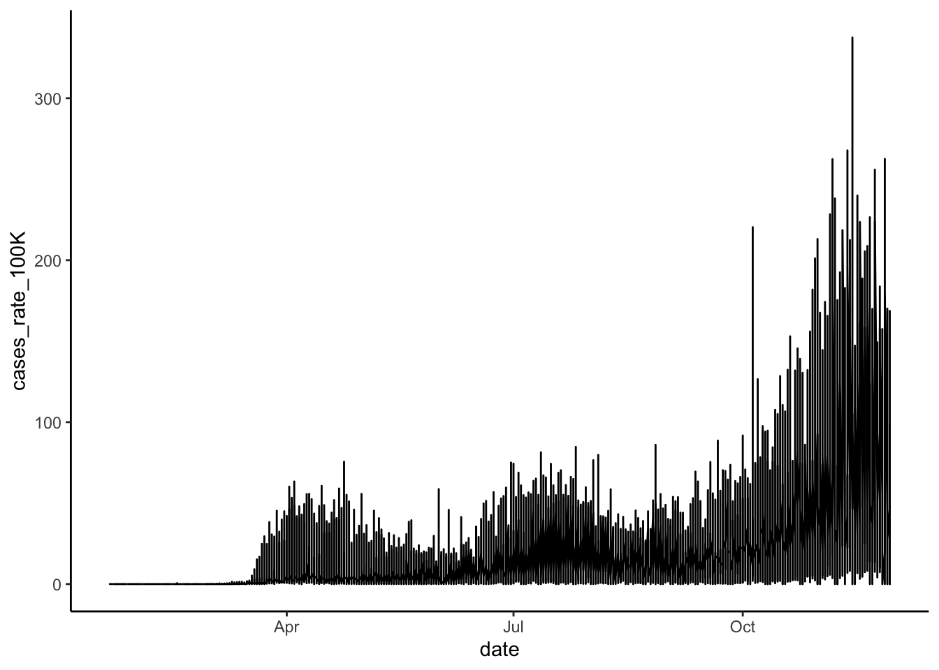
This gives us an overall sense that the rate of cases has increased over time and has become particularly prevalent in the fall of 2020. But, because the lines for each state are not discernible, we can’t see if some states have a different trajectory of case rates than other states. We could try making each state’s line a different color, but with 50 states plus D.C., we won’t be able to easily identify which color hue is associated with which state. A better solution is to use faceting to produce mini-plots for each state.
Let’s create a new line graph of COVID-19 cases rates over time, this time with a separate mini-plot for each state:
# line graphs of covid cases rates for each state
ggplot(US_cases_long, aes(x = date, y = cases_rate_100K)) +
    geom_line() +
    facet_wrap(~ state, scales = "free_y") + # make the y-axis independent for each state
    theme_classic()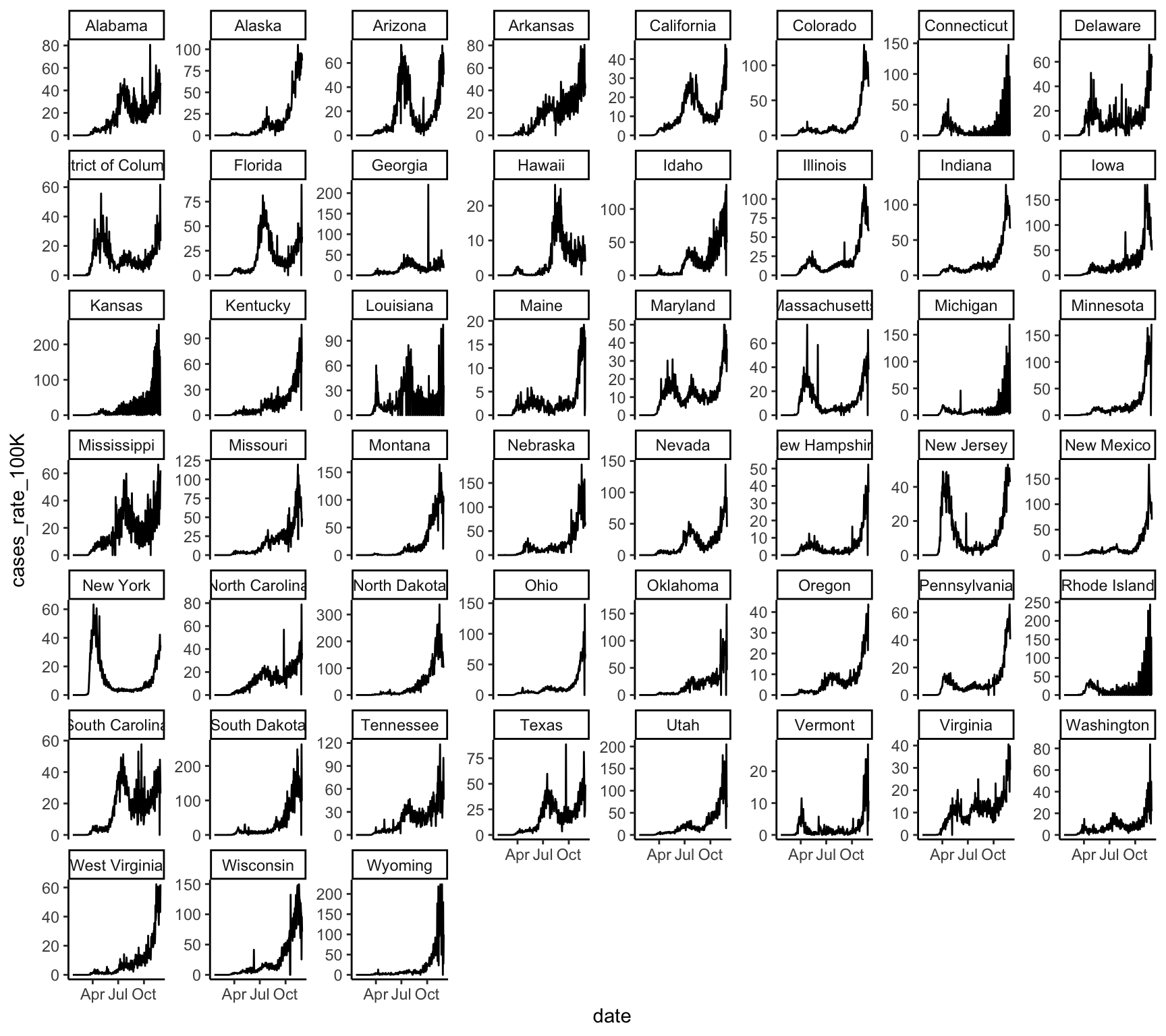
We can try the same strategy for cumulative COVID-19 case rates over time. First, in a graph that jumbles together all the states:
# line graph of cumulative covid cases rates
ggplot(US_cases_long, aes(x = date, y = cases_cum_rate_100K)) +
    geom_line() +
    theme_classic()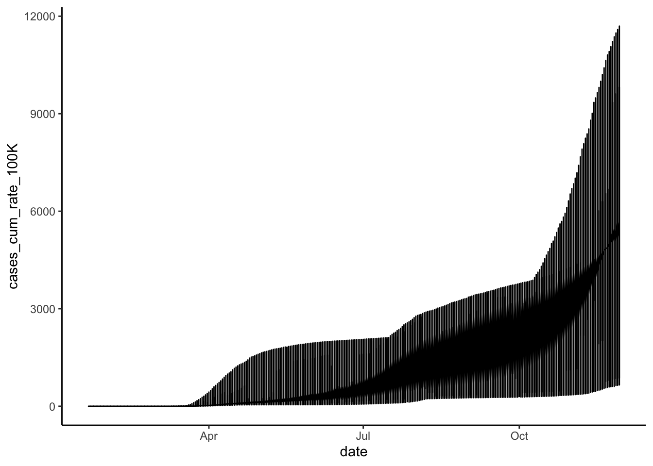
Again, we get a sense of the overall trend here, but we can get a much better picture of state-level differences by faceting. So, let’s create a new line graph of COVID-19 cumulative cases rates over time, this time with a separate mini-plot for each state:
# line graphs of cumulative covid cases rates for each state
ggplot(US_cases_long, aes(x = date, y = cases_cum_rate_100K)) +
    geom_line() +
    facet_wrap(~ state, scales = "free_y") +
    theme_classic()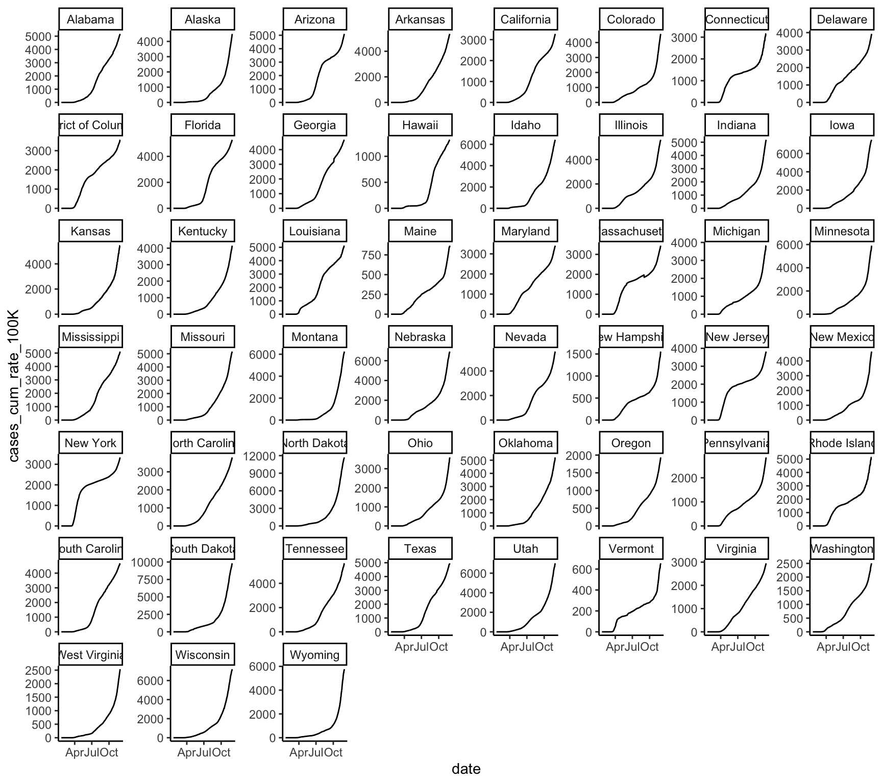
Static Maps
A great way to visualize spatial relationships in data is to superimpose variables onto a map. For some datasets, this could involve superimposing points or lines. For our state-level data, this will involve coloring state polygons in proportion to a variable of interest that represents an aggregate summary of a geographic characteristic within each state. Such a graph is often referred to as a choropleth map. To create a choropleth map we first need to acquire shapefiles that contain spatial data about U.S. state-level geographies.
We can use the tigris package to get Census Tiger shapefiles for census geographies. In particular, we can use the states() function to get state-level geographies, and coastal boundaries can be gathered with the argument cb = TRUE:
# download state-level census geographies
us_state_geo <- tigris::states(class = "sf", cb = TRUE) %>%
    # rename `NAME` variable to `state`
rename(state = NAME)## Rows: 56
## Columns: 10
## $ STATEFP <chr> "12", "78", "30", "27", "24", "45", "23", "15", "11", "69", …
## $ STATENS <chr> "00294478", "01802710", "00767982", "00662849", "01714934", …
## $ AFFGEOID <chr> "0400000US12", "0400000US78", "0400000US30", "0400000US27", …
## $ GEOID <chr> "12", "78", "30", "27", "24", "45", "23", "15", "11", "69", …
## $ STUSPS <chr> "FL", "VI", "MT", "MN", "MD", "SC", "ME", "HI", "DC", "MP", …
## $ state <chr> "Florida", "United States Virgin Islands", "Montana", "Minne…
## $ LSAD <chr> "00", "00", "00", "00", "00", "00", "00", "00", "00", "00", …
## $ ALAND <dbl> 138947364717, 348021896, 376966832749, 206230065476, 2515172…
## $ AWATER <dbl> 31362872853, 1550236199, 3869031338, 18942261495, 6979340970…
## $ geometry <MULTIPOLYGON [°]> MULTIPOLYGON (((-80.17628 2..., MULTIPOLYGON ((…We can now merge the spatial data with our weekly COVID-19 cases data, keeping only the contiguous 48 states (plus D.C.):
# merge weekly COVID-19 cases with spatial data
US_cases_long_week_spatial <- us_state_geo %>%
    left_join(US_cases_long_week, by = c("GEOID", "state")) %>%
    filter(GEOID < 60 & state != "Alaska" & state != "Hawaii")

glimpse(US_cases_long_week_spatial)
## Rows: 2,254
## Columns: 14
## $ STATEFP <chr> "12", "12", "12", "12", "12", "12", "12", "12", "12",…
## $ STATENS <chr> "00294478", "00294478", "00294478", "00294478", "0029…
## $ AFFGEOID <chr> "0400000US12", "0400000US12", "0400000US12", "0400000…
## $ GEOID <chr> "12", "12", "12", "12", "12", "12", "12", "12", "12",…
## $ STUSPS <chr> "FL", "FL", "FL", "FL", "FL", "FL", "FL", "FL", "FL",…
## $ state <chr> "Florida", "Florida", "Florida", "Florida", "Florida"…
## $ LSAD <chr> "00", "00", "00", "00", "00", "00", "00", "00", "00",…
## $ ALAND <dbl> 138947364717, 138947364717, 138947364717, 13894736471…
## $ AWATER <dbl> 31362872853, 31362872853, 31362872853, 31362872853, 3…
## $ week_of_year <dbl> 3, 4, 5, 6, 7, 8, 9, 10, 11, 12, 13, 14, 15, 16, 17, …
## $ pop_count_2010 <dbl> 18801310, 18801310, 18801310, 18801310, 18801310, 188…
## $ cases_count_pos <dbl> 0, 0, 0, 0, 0, 0, 3, 20, 187, 1257, 5275, 7997, 6881,…
## $ cases_rate_100K <dbl> 0.00000000, 0.00000000, 0.00000000, 0.00000000, 0.000…
## $ geometry <MULTIPOLYGON [°]> MULTIPOLYGON (((-80.17628 2..., MULTIPOL…Let’s create a choropleth map for the latest week’s COVID-19 cases using ggplot():
US_cases_long_week_spatial %>%
  # subset data for only latest week
  filter(week_of_year == max(week_of_year, na.rm = TRUE)) %>%
  # map starts here
  ggplot(aes(fill = cases_rate_100K, color = cases_rate_100K)) +
  geom_sf() +
  coord_sf(crs = 5070, datum = NA) +
  scale_fill_viridis(direction = -1, name = "Case rate\n(per 100K population)") +
  scale_color_viridis(direction = -1, name = "Case rate\n(per 100K population)") +
  labs(title = "COVID-19 case rates for last week",
       caption = "Data Sources: Harvard Dataverse, 2020; U.S. Census Bureau, 2019")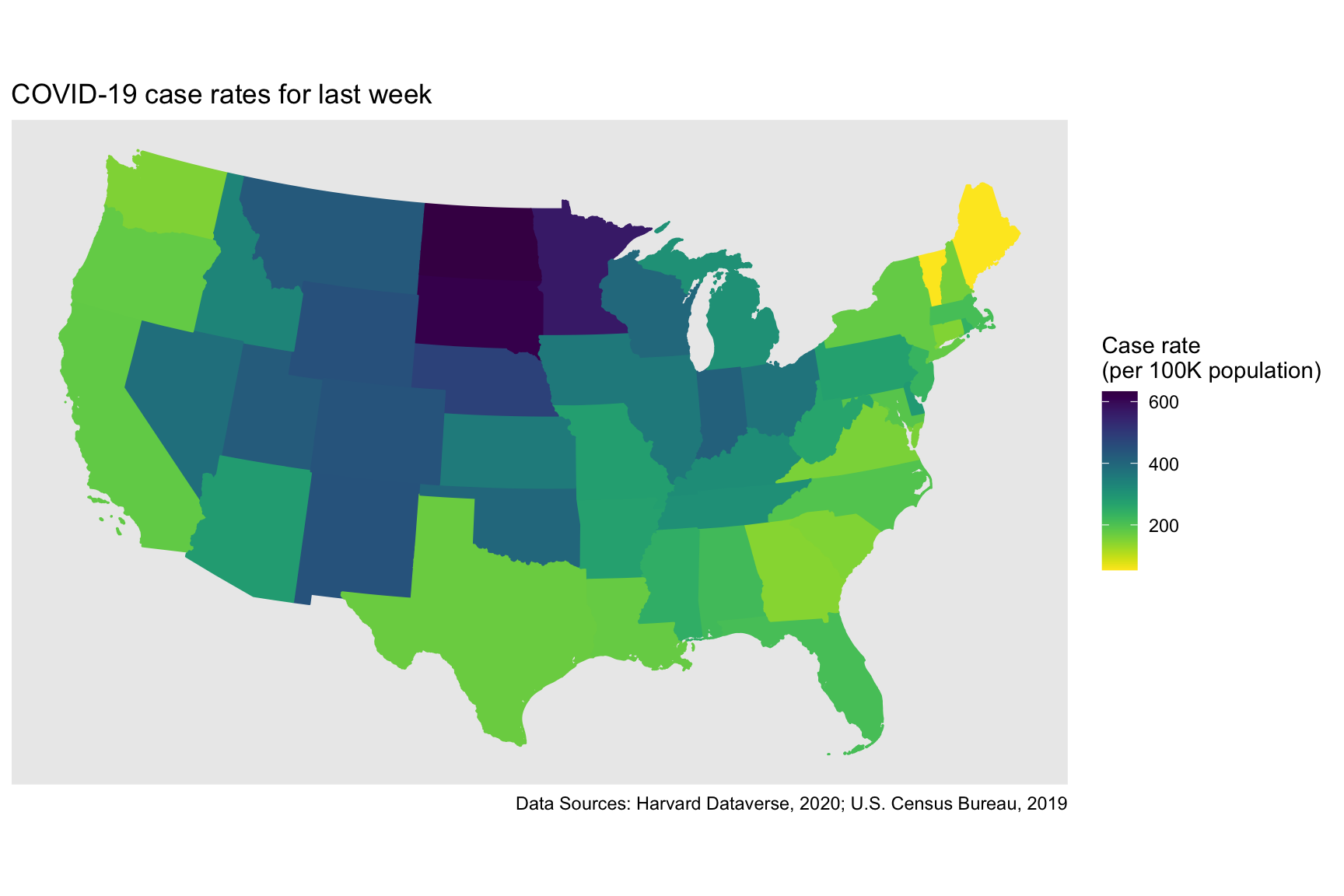
Interactive Maps
Static maps are great for publications. Interactive maps, which can be viewed in a browser, can potentially provide a much richer source of information. A good overview of the mapping functionality in R is provided here: https://map-rfun.library.duke.edu/index.html.
In this section, we’ll focus on building a simple interactive map using the mapview package, which is a data-driven API for the leaflet package.
# set some options for the graph
mapviewOptions(fgb = FALSE, # set to FALSE to embed data directly into the HTML
               leafletWidth = 800,
               legend.pos = "bottomright")

# create map
USmap <- US_cases_long_week_spatial %>%
  # subset data for only latest week
  filter(week_of_year == max(week_of_year, na.rm = TRUE)) %>%
  # map starts here
  mapview(zcol = "cases_rate_100K", layer.name = "Case rates (per 100K)")

# print map
USmap@map